
Blue is seen as trustworthy, dependable and committed. The color of sky and the ocean, blue is perceived as a constant in our lives. As the collective color of the spirit, it invokes rest and can cause the body to produce chemicals that are calming; however not all blues are serene and sedate. Electric or brilliant blues become dynamic and dramatic, an engaging color that expresses exhilaration. Some shades or the overuse of blue may come across as cold or uncaring."
The color blue can make you feel calm and sedate, and can give off a cool appearance, blue is said to aid intuition.
One of the attributes I greatly love about the color blue is the many looks that can be achieved with this one color. I find blue to be a great color for not only modern & minimal decor but also country decor and contemporary decor, then of course there is the masculine and feminine ways to use the color as well, which blue does, equally well for both.
FOYERS & ENTRANCE HALLS

LIVING AREAS

A feminine atmosphere is achieved with the use of powder blue.

Tan paired with bright blue along with a mix of furnishings creates an eclectic and formal vibe, while the white trim gives it a more modern look.
FAVORITE!

An old flat structure with wide open windows and carved ceiling moldings scream vintage while furnishings and the use of a large modern area rug screams modern. The combination of an old structure and modern furnishings gives off an essence of a NY-style.

Romanticism reaches new heights with the help of powder blue floors and tufted sofa. But really the romantic look of the room is achieved by the use of a combination of things (as always) it is rarely ever because of one piece in the room. In this case, the powder blue tufted sofas paired with the ivory tufted sofas... and the beautiful wall mirror helps too of course.
KITCHENS

Giving blue the center of attention is sometimes all it needs to stand out. Probably the best way to transition yourself into a color if you're hesitant to go all out.

The modern minimal kitchen
glossy versus matte

DINING ROOMS

Blue goes temporary with bright blue, and with the help of a few wall accessories in a black and white motif.

Blue goes minimal and masculine in navy matte blue, with the help of a few "manly" accessories: stag chandelier and goat horns. The open window and clean setup keeps it minimal while the splash of orange keeps it smart... a great way to go with small spaces.

Blue goes sophisticated with a semi-glossy navy blue with sea green accents. The wall to ceiling navy blue keeps it enclosed and personal, while the gold framed pictures and side buffet with all the choice trimmings keeps it formal.
FAVORITE!

The country-style kitchen with blue in all the right places!
BATHROOMS
FAVORITE!

Who says you can't mix contemporary with rustic? The rustic-styled cabinetry paired with contemporary rocking wall mirrors AND contemporary blue wall tiles keeps this bathroom looking fresh and easy-going while at the same time all-around beautiful.

A humble bathroom is made beautiful and serene with the use of sky blue.

One of the favorite ways to use blue in bathrooms? Going minimal modern. The cool colored blue which also happens to be soothing is great to use minimally while keeping the decor chic... and of course, soothing.
BEDROOMS
FAVORITE!
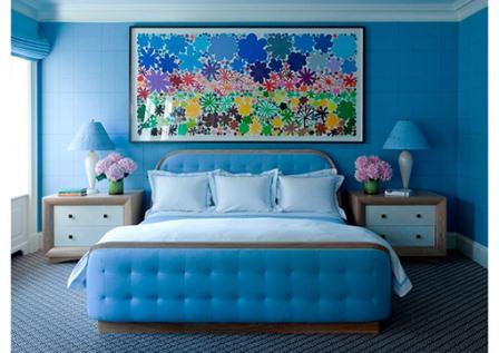
The use of a large mural or wall art of some sort to incorporate blue into the bedroom is my favorite way of strategically drawing the eye to blue. In the above pictured room the large framed wall art adds a splash of color to the very blue room, this just so happens to make the blue all around the room stand out even more. The room pictured below featuring wall paper with an even distribution of blue coordinates with the blue on the bed, the bedsheets and the wall paper are working together to draw the eyes to the blue in the room. Now these are two extremely smart strategies to make notice of blue.


Blue used in conjunction with white for a mod appeal is pretty popular, I've seen it pretty much everywhere, from my friend's home to a hotel room. The vibe is mod and cool, the style chic. And if you just happen to have a large shag rug, this is probably a really fun look to go for.